Sweeden and Coffee: Yes Please
20130528-154521.jpg
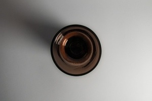
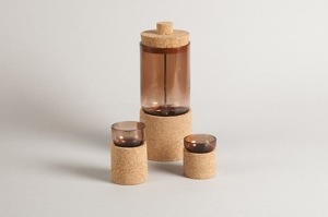
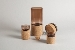
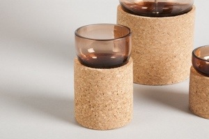
As far as coffee sets go, this is one of the most interesting that I’ve seen in a long time. When Raúl Arribas designed the product, he had the two Swedish traditions of glass blowing and coffee in mind. He used the Spanish material, cork, to work with the tinted glass and produced a set that it visually very striking. Often, I dislike the use of brown glass – it reminds me of garish home décor from the eighties. Yet for some reason, the colour used in this product, alongside the cork, is very elegant. Add to the cafetiere and glasses the depth of the coffee which will swim within and the look will be grown up, original sophistication. There’s clearly a lot more to Swedish designers than Ikea lets on…
20130528-154552.jpg

20130528-154602.jpg

20130528-154608.jpg

Maple Edison Lamp

20130517-115429.jpg
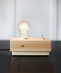
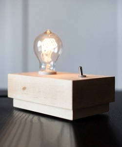
The Maple Edison Lamp strips the lighting process back to basics. The lamp consists of an original Edison 40W Filament bulb, supported by a clean maple base. I find Edison bulbs very stunning and aesthetically pleasing on their own and the minimalist design of this product allows it to shine – pun absolutely intended. I’m also very fond of the flip switch, which are increasingly rare these days. They bring back memories of near electrocution from the Victorian building where I went to school. Fond times. The design is so simple that it almost looks like an experiment being carried out in a Science class. In an industrial setting, it’d be the perfect form of lighting.

Via Dot & Bo

20130517-115556.jpg

B-Iron 725: The Transparent Iron

20130510-144140.jpg
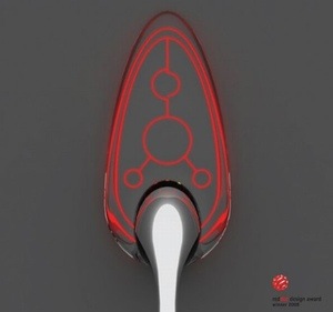
This transparent iron has got creative ingenuity written all over it. The design uses tempered glass on the soleplate of the iron to allow you to clearly see the creases that you’re trying to remove. In terms of product design, designers Dong-Seok Lee and Ji-Hyung Jung are definitely making me enthusiastic about the future. Identifying problems with equipment that we use daily, and trying to find a way around them, is what makes modern design so appealing and lucrative. In a similar way to the Transparent Toaster, the designers have altered the material of the appliance to allow visibility where it is conventionally, and infuriatingly, opaque. What’s more, it is executed in a stylish, visually appealing way. No longer will irons be hiding in cupboards…

20130510-144220.jpg

Via Design Buzz

Glass and Iron Bookshelf

<p>Clear Glass</p><p>Dimensions: Adj H: shlf 9 1/4-19 1/2''H: shelf''</p><p>H: 82 1/2'' • W: 40'' • D: 13''</p><p>Material: Iron, Glass</p>,Worchester Natural Iron/Glass Bookshelf, Arteriors, worcester, BookcaseOn Wednesday, I featured an article on Iron and Glass Windows. This bookshelf from Project Decor is another example of these two materials working together to produce something aesthetically wonderful. The bookshelf has a clean, minimal design, but is enhanced by the smaller details. Firstly, the fact that the shelves are not all the same adds a little quirkiness to the product – almost a geometrical effect. Also, the frame of the bookshelf is made out of ridged iron (see image below), rather then the straight iron often used for furniture. This adds an interesting border, but does not overbear the simplicity of the design. Even though they have an industrial feel, I think that this bookshelf would fit in with most interiors.

Glass Sign: Solar Powered Pedestrian Crossing

20130501-131313.jpg
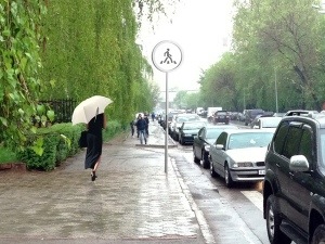
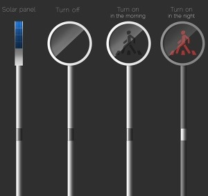
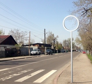
This is one of those products that I can’t believe hasn’t been invented sooner. The Glass Sign is a solar powered pedestrian crossing, designed by Almasov Aibek. The sign is switched off when not in use, and is then activated when a pedestrian swipes the signal pole. Throughout the day, the sign is charged with solar energy and the ‘walk’ signal appears in black. After dark, the signal comes up in a vibrant red colour, so that it is visible against the depth of the night. The walking signals stay active for a period of time determined by the width of the road. It’s a very clever idea and looks good when being used. I’d love to see a picture of it in use at night, but haven’t found any yet…

Via Yanko Design

20130501-131447.jpg

20130501-131505.jpg

20130501-131459.jpg

Iron and Glass Windows: Industrial Splendour

20130501-104227.jpg
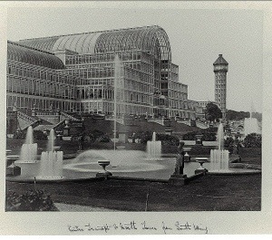
The combination of glass and iron in design is very reminiscent of Victorian architecture. Some of my favourite buildings in this period were built with these materials, including London’s Crystal Palace, pictured above. This stunning piece of architecture was built in London’s Hyde Park to host the Great Exhibition of 1851. At the time of its construction, it included the most amount of glass ever used in a building. Resultantly, there was little need for interior lights as there was an abundance of natural lighting – hence Crystal Palace. Following the exhibition, the building was reconstructed in South London suburb, Sydenham Hill. It stood there until 1936 when it was sadly destroyed by a fire.

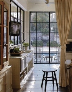
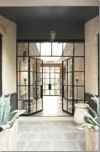
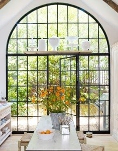
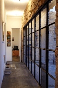
The design which was revolutionised in the industrial age still holds some inspiration for modern times. Windows made from steel and glass can work very well, especially in industrial inspired interiors. The thick steel lines which break up the extent of the glass add an interesting touch to the transparency. Below, I have selected some beautiful instances of this:

20130501-104253.jpg

20130501-104301.jpg

20130501-104316.jpg

20130501-104327.jpg

20130501-104333.jpg

The Round Window

20130430-115459.jpg
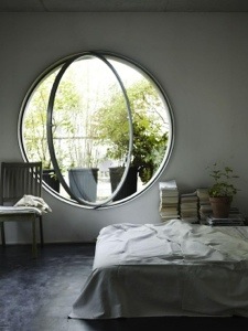
The photo above has given me a severe case of window envy. I absolutely love the use of the circular window in this home. Perhaps this is an expression of my deep yearning to live on a submarine, but I find round windows to be far more effective than the standard rectangular ones. They are visually more interesting as they don’t follow the contours of typically straight building structures. This makes them more of a focal point. I’m very fond of the axis-like opening that this particular window has too. It could be slightly dangerous for passersby outside, but sometimes aesthetics should come well above health and safety…

Urban Hanging Chandelier by Uncovet

20130429-132419.jpg
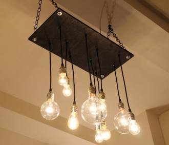
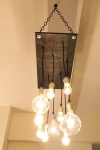
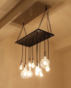
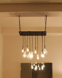
With modern décor, classic chandeliers have a tendency to look out of place. It is difficult to compliment the ornate sophistication which they ooze against a minimal backdrop. This Urban Hanging Chandelier by Uncovet bridges this gap, warmly welcoming the chandelier into the 21st century. The fixture consists of multiple light bulbs which are hung from reclaimed plywood. The plywood itself is hung from the ceiling with thick metal chains. The result is an industrialised light fixture that would look great in an urban inspired room. The product is enhanced further with the light bulbs being an array of shapes and sizes. This makes the item visually more appealing and will also create wonderful effects with light. The ambitious task of tackling a classic has been pulled off perfectly with this modern take on the chandelier.

20130429-132619.jpg

20130429-132631.jpg

20130429-132638.jpg

Hard Drinker: Concrete Tumblers

20130424-122330.jpg
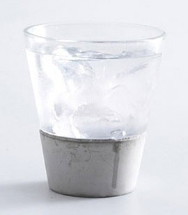
If you’re a dedicated follower of Glassed Blog, you’ll be more than aware of my penchant for minimal, industrial design. Simple and effective, these glasses from Uncrate are a beautiful example of that niche. The concrete section of the product works as an excellent base for a tumbler, providing a stability and weight that avoids spillage. The harshness of the concrete is counteracted by the simple delicacy of the glass top. The end product is a drinking glass that mixes masculinity and femininity in perfect proportions. A glass as elegant as this can be used for any kind of beverage.

It’s In The Trees! The Mirrorcube, Treehotel

20130423-103023.jpg
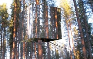
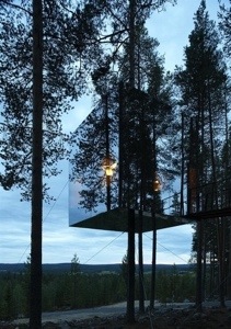
When the yearning comes for getting away from the hectic reality of modern life, few places will satiate the desire better than the Tree Hotel in Sweeden. Designed by Tham & Videgård Arkitekter, the 4x4x4 metre ‘Mirrorcube’ consists of a lightweight aluminium frame hung from a tree trunk. The structure is dressed up with reflective glass, which mirrors the natural environment outdoors and camouflages the hotel room.

20130423-103104.jpg

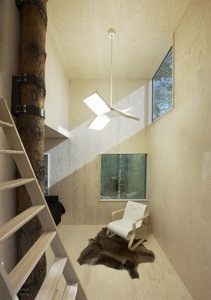
Within the cube, the room is decorated in rustic, understated plywood and caters for two people. We may be touching on Tardis territory when I tell you that within this seemingly petite cube, there is a double bed, a kitchen, a bathroom, a living room and a roof terrace (not technically within!). All of this is accessed via a 12 metre bridge.

20130423-103144.jpg
The main selling point of this novel hotel room surely has to be the 360º panoramic view of the beautiful natural surroundings that the guests have. Elevated and secluded with sights of lakes and mountains, this hotel room is design at its best.